Web Choice builds complete digital brands for UK businesses. One team handles your strategy, logo, colour palette, typography, tone of voice and brand guidelines, then applies them to your website and social channels, so customers meet the same business everywhere.
Rated 4.8/5 on Google Reviews · 1,400+ projects since 2009
Bristol based since 2009. No obligation: a specialist will review your current brand and reply with honest next steps.
Trusted by businesses across the UK







Projects delivered
In business since 2009
Client retention
Google Reviews
FreeIndex rating
Client reviews


Digital branding is the process of defining who your business is and expressing it consistently online. It covers your brand strategy, visual identity (logo, colour palette, typography and imagery), tone of voice, and the brand guidelines that keep everything consistent across your website, search results, social media, email and advertising.
Most customers come across a business several times before they get in touch. They might see you in a Google result, on a map listing, in a social post, in a review or in an answer from an AI assistant. When your business looks and sounds the same each time, it becomes familiar, and familiar businesses are easier to trust. That is the job of a good brand.
What a clear brand does for your business:
Book the complete project, from strategy to rollout, or choose only the parts you need.
Purpose, values, personality and a clear position in your market, plus business or product naming if you need it.
A complete logo suite: primary, horizontal, icon and favicon versions, with rules for using them.
A palette with clear roles, values for screen and print, and accessible contrast built in.
Heading and body fonts that suit your personality, read well on mobile and are licensed correctly.
How your brand sounds, written up with examples by our copywriters.
One clear reference that keeps your team, printers, developers and agencies consistent.
Your new identity applied to your website, social channels, email, print and stationery.
Modernise an existing brand without losing the recognition, or the search rankings, you have earned.
Review monitoring, response guidance and consistent profiles that protect how your brand is seen.
A brand built in the wrong order usually ends up as a logo with nothing behind it. We work through eight stages, and each one feeds the next, so every design choice can be explained by the strategy underneath it.
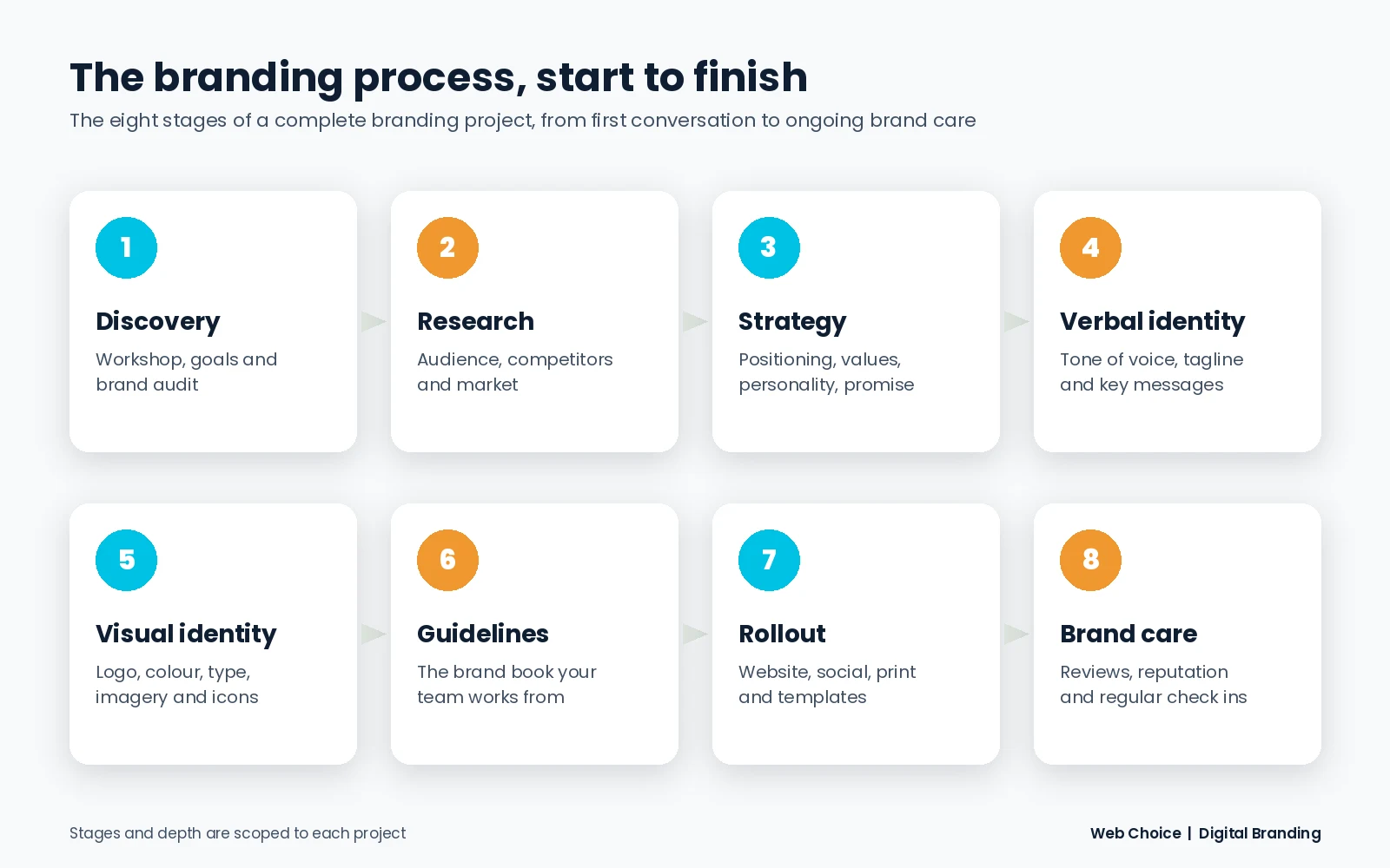
We begin with a workshop with you and the people who know the business best. We talk about where the business is today, where you want it to be, the customers you want more of and what genuinely sets you apart. If you already have a brand, we audit everything currently in use: your website, social profiles, Google Business Profile, documents, signage, and how you appear in search results and reviews.
What you get: a discovery summary and an audit showing what to keep, what to fix and what to retire.
Next we look closely at your audience: what they need, what worries them, how they search and where they make buying decisions. We also review how your competitors present themselves, so your brand stands apart instead of blending in with everyone else in your sector.
What you get: audience profiles and a competitor map that shows the space your brand can own.
Strategy is the foundation the rest of the brand is built on. Together we define five things:
What you get: a brand platform that fits on one page and guides every decision that follows.
Your brand has to sound right as well as look right. Our copywriters turn your personality into tone of voice principles, with examples of what to say and what to avoid. We then write the core messages: tagline options, a short description of what you do, and key messages for each audience you serve. If you need a new business or product name, we develop and check name options at this stage too.
What you get: a tone of voice guide and a messaging framework your team can write from.
This is where the brand becomes visible. We explore concepts, explain the thinking behind each route and refine your chosen direction with your feedback. The visual identity covers your logo suite, colour palette, typography, photography and illustration style, icons and supporting graphic elements. Each is explained in more detail below.
Everything is documented in brand guidelines, so the brand is used correctly long after the project ends, by your team and by anyone you work with.
A brand only works when customers actually see it. We apply your new identity to your website, social media profiles, email signatures, presentation and document templates, business cards, stationery, brochures, signage, Google Business Profile imagery and advertising. Because Web Choice also designs and builds websites, your brand moves straight into your site without handovers between agencies.
Your brand also lives in what other people say about you. After launch we can help you monitor reviews and mentions, respond well, and update your guidelines as the business grows, so the brand stays consistent and up to date.
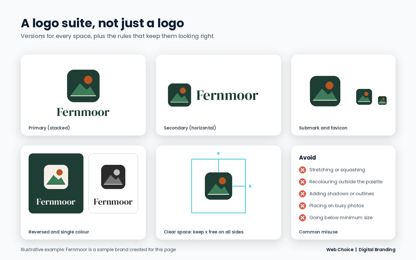
Your logo has to work on a website header, a phone screen, a social avatar, a van and a 16 pixel browser tab. That is why we design a logo suite: a family of versions that share one identity, each made for a different space.
| Logo type | What it is | Works well for |
|---|---|---|
| Wordmark | Your business name in a distinctive typeface | Businesses with a short, memorable name |
| Lettermark or monogram | Initials designed as a mark | Long names, or names known by their initials |
| Pictorial mark | A recognisable symbol or icon | Brands that want a simple standalone symbol |
| Abstract mark | A geometric form that suggests an idea | Technology and service brands with abstract offers |
| Combination mark | A symbol and wordmark used together | Most growing businesses, as the parts can separate |
| Emblem | Text set inside a badge or crest | Heritage, education, food and drink brands |
the strategy, personality and audience from earlier stages
broad exploration of ideas before anything goes on screen
the strongest routes presented, with the reasoning behind each
your chosen route developed with your feedback
checked at tiny sizes, in one colour, reversed out and on photography
every version prepared and documented
The number of logo concepts and rounds of revisions depends on your requirements, and is agreed with you before work starts.
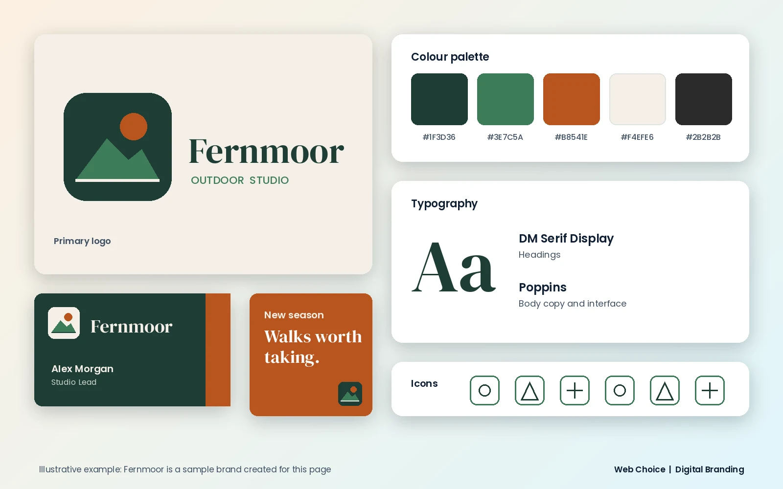
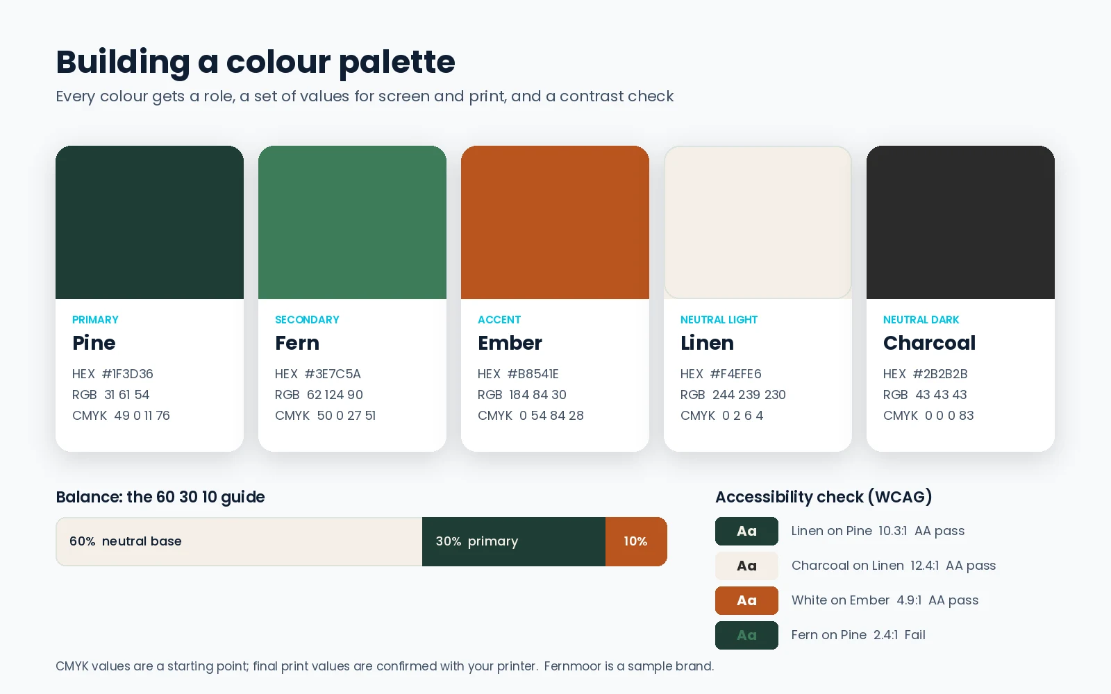
Colour is often the first thing people remember about a brand. A good palette is chosen for meaning, tested for practicality and documented so it is reproduced the same way everywhere.
Colours carry associations. Blues are often linked with trust and calm, greens with growth and nature, oranges with energy and warmth, and deep neutrals with premium quality. These links shift with culture and context, so we use them as a starting point alongside your strategy, never as a formula. We also check the colours your competitors use, so you are not mistaken for one of them.
A simple balance that works for most brands is the 60 30 10 guide: roughly 60% neutral base, 30% primary colour and 10% accent. It keeps layouts calm and makes your calls to action stand out.
Each colour is specified as HEX for websites, RGB for screens and CMYK for print, with Pantone references where you print in spot colours. This is what stops your brand from looking slightly different on your website, your signage and your brochures.
We test colour combinations against the Web Content Accessibility Guidelines (WCAG). Normal text needs a contrast ratio of at least 4.5:1 against its background, and large text and interface elements need at least 3:1. Accessible colour helps every visitor read your content, and it is a sign of a well run business.
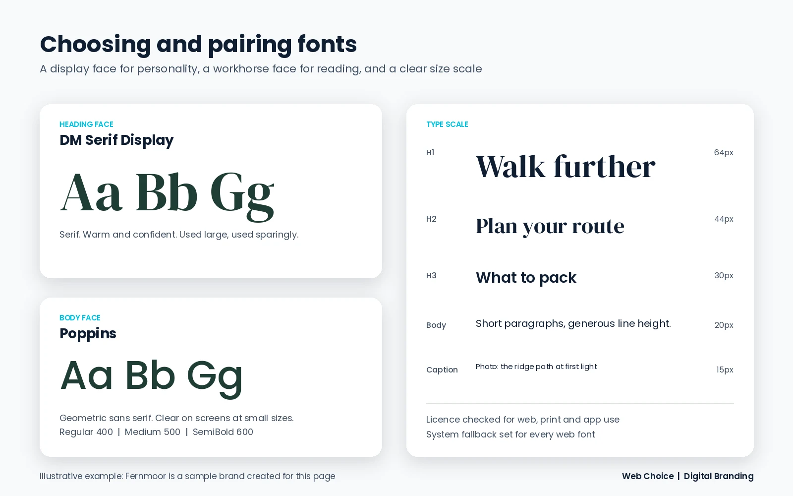
Type carries your tone before anyone reads a word. The same sentence feels different set in a classic serif, a clean sans serif or a hand drawn script. We choose fonts for personality first, then check they work in the real world.
Most brands need no more than two font families: a heading font with character and a body font built for easy reading. Good pairs contrast in style but share similar proportions. We then set a type scale from H1 down to captions, so every page has a clear visual hierarchy.
Alongside the core identity we define a photography style (lighting, subjects, framing), an illustration approach where it suits the brand, a consistent icon set, and supporting shapes, patterns and layout grids. These details make a brand recognisable even when the logo is not on screen.
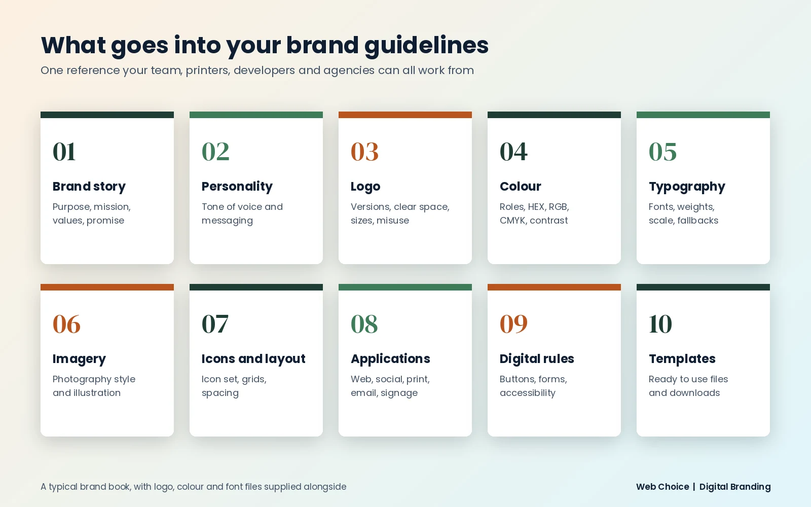
Brand guidelines, sometimes called a brand book, are the rulebook for your brand. They mean anyone creating something for your business, from a new starter to a printer or a web developer, gets it right without guessing.
What goes into your brand guidelines:
We write guidelines in plain English with visual examples, so they are quick to use. They are kept as concise as possible: guidelines that run to a hundred pages tend to sit unread in a folder.
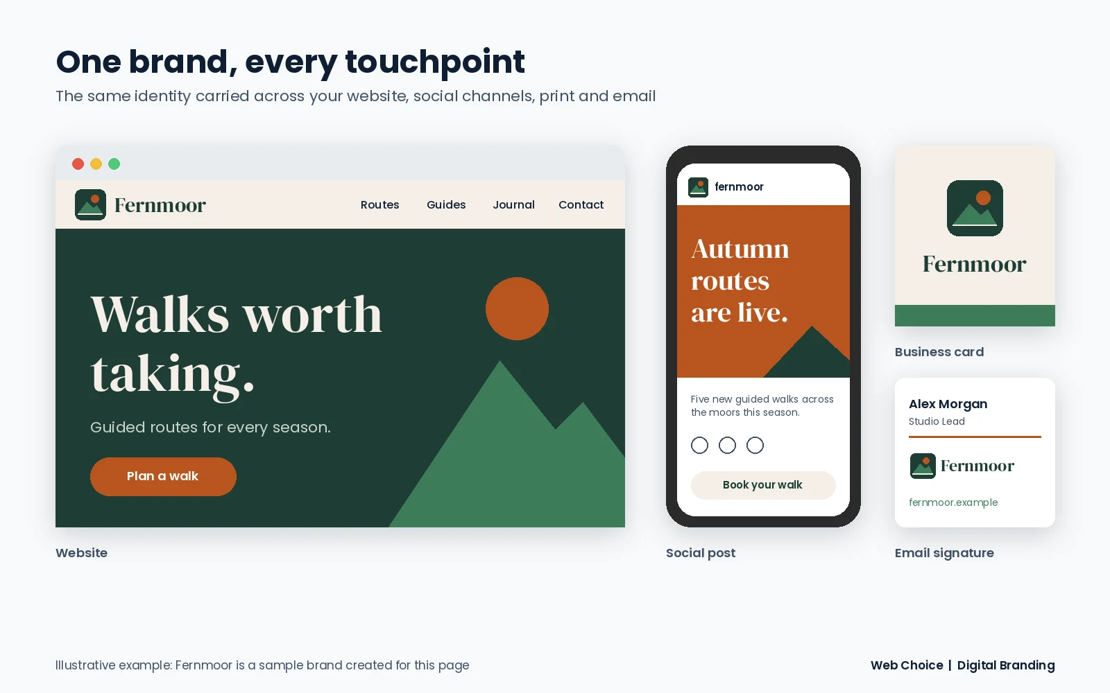
Your new brand should reach customers everywhere they meet you. Web Choice can carry it through:
| Brand refresh | Full rebrand | |
|---|---|---|
| What changes | Logo, colours, fonts and imagery are modernised | Strategy, positioning and identity are rebuilt, sometimes including the name |
| Recognition | Existing recognition is kept | Recognition is rebuilt around the new brand |
| Typical trigger | The brand looks dated or inconsistent | The business, audience or offer has changed |
| Effort | Lighter, faster project | Full eight stage process |
Signs it is time to look at your brand:
A rebrand should not cost you the visibility you have built. Our SEO team plans redirects for any changed pages or domains, updates your Google Business Profile, social profiles and directory listings, refreshes your logo in structured data, and keeps your business name, address and phone number identical everywhere. Learn more about our SEO services.
Before customers choose you, they need to find you. Search engines and AI assistants build their understanding of a business from the signals it leaves online: your website, your business listings, your reviews and what other sites say about you. When your name, logo, description and details are consistent everywhere, those systems can understand who you are and recommend you with confidence.
That is why every Web Choice branding project considers search from the start, with consistent business profiles, Organization structured data that connects your website to your social profiles, and content written in your brand voice that answers the questions customers ask. Find out more about our AEO services.
“What stands out most about WEB CHOICE is their forward-thinking approach to modern search.”Georgina Frere, Scoliosis SOS Clinic
In business, reputation is everything. Reviews, social comments and search results now shape first impressions long before a customer speaks to you. Good reputation management is about earning trust openly, not hiding feedback.
See the brands and websites we have built for clients in our portfolio, or read our website case studies.
Digital branding is the process of defining who your business is and expressing it consistently online. It covers your brand strategy, visual identity (logo, colour palette, typography and imagery), tone of voice, and the brand guidelines that keep everything consistent across your website, search results, social media, email and advertising.
Your brand is what people think and feel about your business. Your brand identity is the set of tools you use to shape that perception, including your logo, colours, fonts, imagery and tone of voice. A logo is one part of the identity: the mark people use to recognise you.
Brand guidelines usually include your brand story, values and personality, tone of voice, logo versions and usage rules, colour palette with HEX, RGB and CMYK values, typography, imagery style, icons, layout rules, accessibility guidance and examples of the brand applied to your website, social media, email and print.
We start from your brand strategy and the personality you want customers to feel, then check what competitors use so you stand apart. Each colour is given a role (primary, secondary, accent or neutral), defined for screen and print, and tested for accessible contrast before it is approved.
We look for typefaces that suit your brand personality and read clearly on mobile screens. We usually pair a heading font with a body font, set a size hierarchy, and check character sets, available weights, licensing for web and print, and the effect on website loading speed.
It depends on scope. A logo refresh moves faster than a full brand strategy, identity and guidelines project. After the discovery stage we give you a timeline for each stage, so you know what is happening and when.
Branding is priced on scope, so there is no fixed menu. The quote reflects which stages you need, from strategy and research through to logo design, guidelines and rollout. You will see exactly what is included and why before you commit to anything.
A refresh updates how your brand looks and sounds while keeping the recognition you have built. A full rebrand goes deeper and revisits your positioning, and sometimes your name. If customers still understand what you stand for, a refresh is usually enough.
A visual rebrand on its own should not harm rankings. Risk comes from changing domains, page addresses or content without a plan. Our SEO team maps redirects, updates your Google Business Profile, social profiles and structured data, and keeps your business details consistent everywhere.
Yes. Web Choice designs and develops websites, so your new brand goes straight into a website built to generate enquiries. Copywriting, SEO and social media support are also available, which keeps the whole rollout with one team.
Book a free, no obligation branding consultation. We will look at your current brand, talk through your goals and give you honest next steps, whether you need a full rebrand or a few careful updates.
Call +44 117 239 5357 · Email info@webchoiceuk.com · Henleaze House Business Centre, 13 Harbury Road, Bristol, BS9 4PN