

I hope you enjoy reading this blog post. If you want my team at Web Choice UK to handle your web design and marketing, click here to get in touch.
Editor: Daniel BurtShort answer: Anxious visitors hesitate because they can't picture what happens next, what it costs or whether they'll be in control. Good UX answers those questions before they're asked. Show prices up front, lay out each step with how long it takes, let people describe their problem in their own words, ask one thing at a time, and never make them repeat themselves.
Why anxiety is a UX problem
Some websites are visited by people who would rather not be there. Patients booking a dentist, clients contacting a solicitor, pet owners calling the vet after something has gone wrong. For them the website is the first step towards something they're dreading, and every unanswered question makes it easier to close the tab.
Research on anxiety keeps coming back to the same point: what people can't predict worries them more than what they can. A 2025 review in the Journal of Anxiety Disorders, drawing on 45 studies, again linked intolerance of uncertainty with anxiety, in that case among older adults. Put simply, not knowing is a big part of what makes people anxious.
That gives designers something to work with. You can't make a filling pleasant, but you can take away a lot of the not knowing.
Dentistry shows the size of the problem. In the Adult Oral Health Survey 2023, published by the Office for Health Improvement and Disparities in December 2025, 15% of adults in England with natural teeth had extreme dental anxiety and a further 40% had moderate or severe anxiety. Asked about specific parts of treatment, 37% said having a tooth drilled would make them very or extremely anxious, and 32% said the same about an injection.
Cost adds another layer of worry. In the same survey, 23% of adults said cost had led them to delay treatment, and 30% said it had influenced the type of care they chose. Among adults who hadn't been to a dentist for two years or more, 31% said they couldn't afford the charges and 17% said they were afraid to go.
What anxious visitors are trying to find out
Before they book, nervous visitors tend to be asking five things:
- What's wrong, and what will they do about it?
- How much will it cost?
- What will actually happen, and how long will it take?
- Can I stop if I need to?
- Will I have to explain everything again when I get there?
On a lot of websites the answers are spread across separate pages, written in clinical terms, or left for a phone call. We designed a concept practice, Ivory Lane Dental, around answering all five on the way to booking. Here's how.
Seven design patterns for anxious users
1. Let people describe the problem in their own words
Most patients don't know whether they need a crown or a root canal. They know a tooth at the back hurts when they drink something cold.
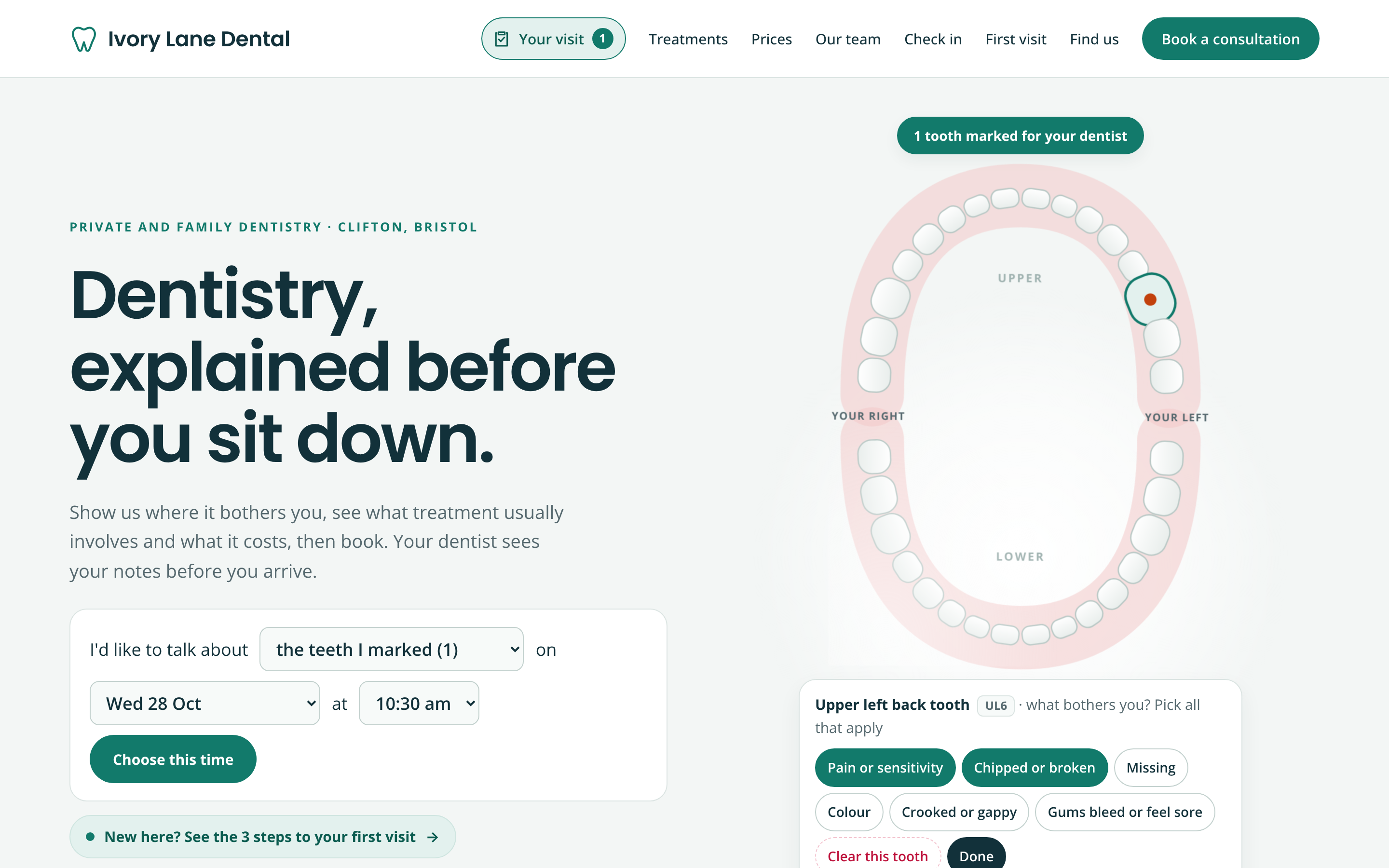
So the Ivory Lane home page opens with a mouth chart instead of a list of treatments. Visitors tap the tooth that bothers them and choose what's wrong: pain or sensitivity, chipped or broken, missing, colour, crooked or gappy, or sore gums. A tooth can have more than one problem. The chart labels the tooth the way a dentist would (UL6, the upper left back tooth), suggests the treatment usually discussed with a guide price, and fills in the booking line.
Patients mark the tooth that bothers them in their own words; the chart does the clinical labelling.
The visitor has said what's wrong without needing a single clinical word, and the dentist gets a clearer note than "toothache".
2. Show the price before they have to ask
If nearly a quarter of adults have delayed treatment because of cost, hiding the price behind a phone call is a poor choice. A guide price ("from £550") with a plain note on what it depends on lets people decide whether to go ahead before they've spoken to anyone.
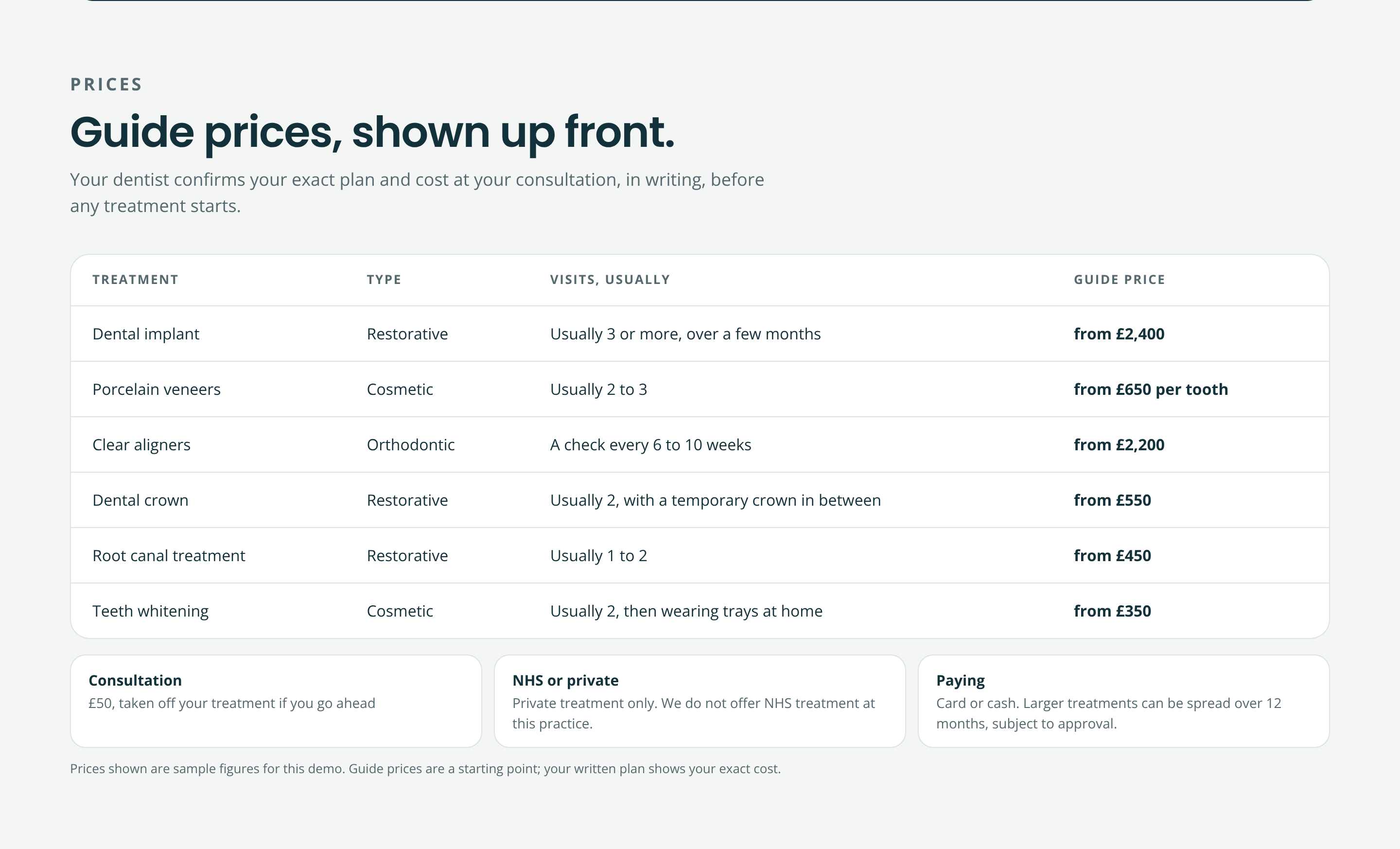
Guide prices with the usual number of visits, and a clear note that the written plan confirms the cost.
The Ivory Lane price list puts the type of treatment, the usual number of visits and the guide price in one table, with the consultation fee and payment options underneath. The final figure still comes from a written plan, and the page says so.
3. Show the whole journey, with timings
"Dental implant" tells most people very little. "A consultation and scan, an appointment of one to two hours to place the implant, three to six months of healing, then the crown" tells them what they are signing up for.
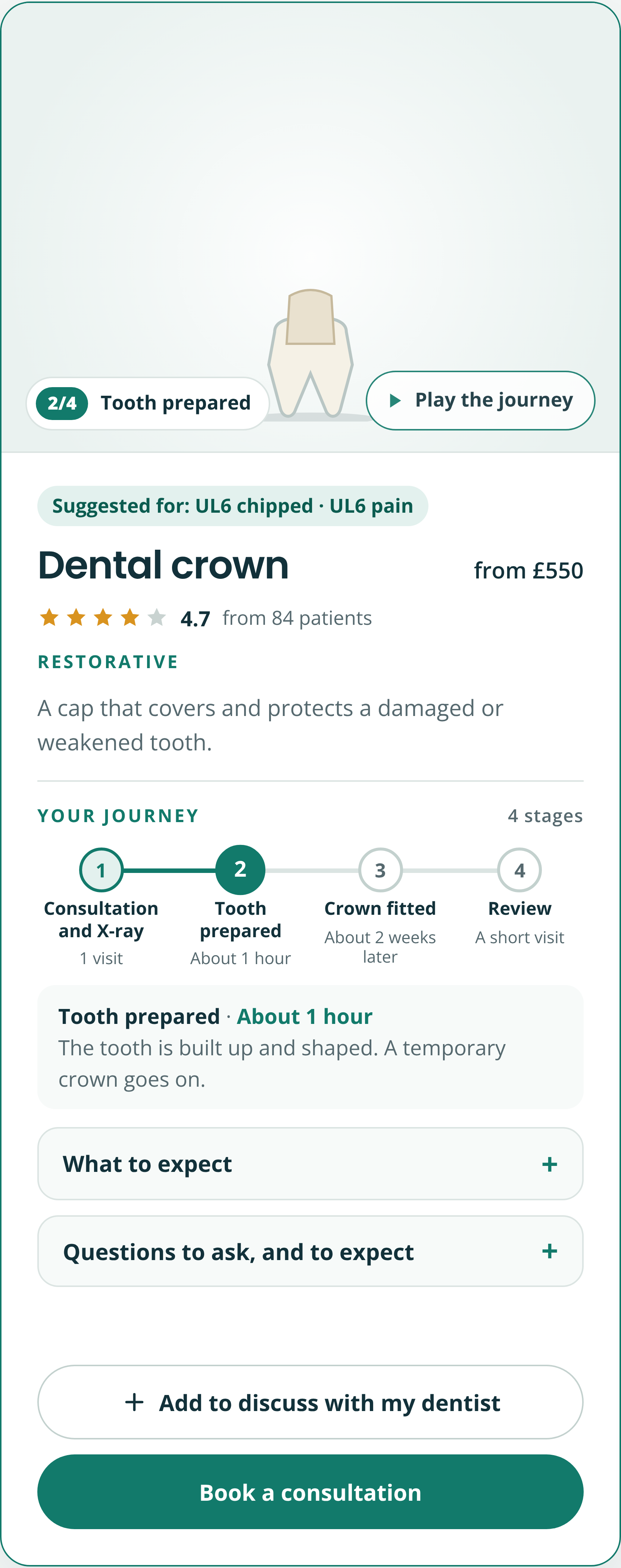
Each treatment card plays through its stages as a small illustration, with how long each one usually takes. Tap a stage and it explains what happens in a sentence. For a crown that reads: consultation and X-ray (one visit), tooth prepared (about an hour), crown fitted (about two weeks later), then a short review.
Each treatment plays through its stages with how long each one usually takes.
When a patient arrives already marked as having a chipped, painful upper left tooth, the card says so: "Suggested for: UL6 chipped · UL6 pain".
4. Walk them through the visit before it happens
Before a first visit, much of the worry is about the morning itself: where to go, what to bring, what happens in the chair.
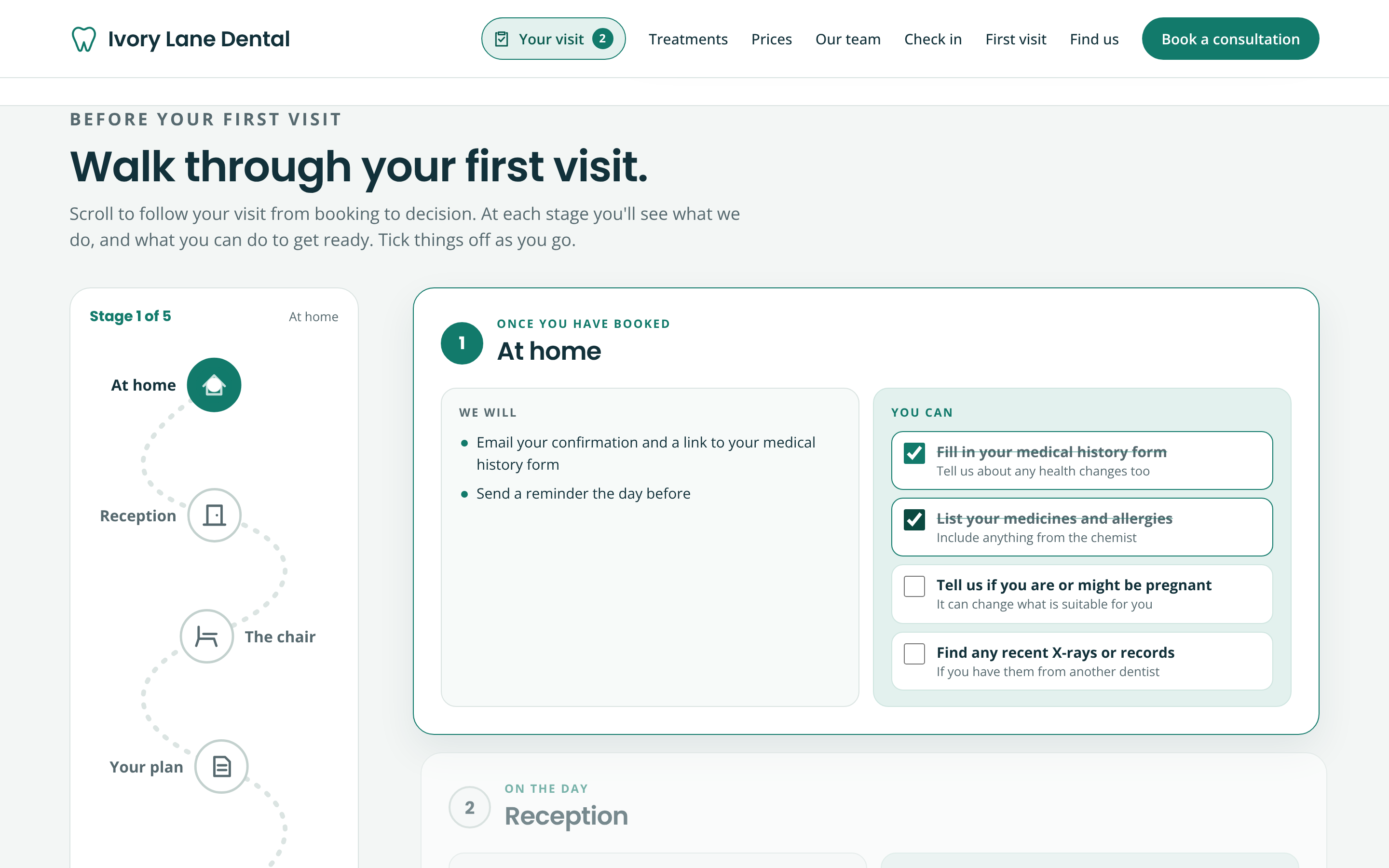
The "Walk through your first visit" section follows a marker along five stages (at home, reception, the chair, your plan, afterwards) as the visitor scrolls. Each stage has two columns: "We will" and "You can". The second column is made of small tick boxes (fill in your medical history, list your medicines, arrive about ten minutes early) that fill a "Ready for your visit" ring.
'We will' beside 'You can': what the practice handles, and small tasks the patient can tick off.
Splitting it this way does two jobs. It shows what the practice takes responsibility for, and it gives the patient something useful to do while they wait.
5. Make promises people can check
Lines like "we care about nervous patients" turn up on a great many practice websites, and visitors have learned to skip them. A promise is more believable when it's specific and the visitor can try it.
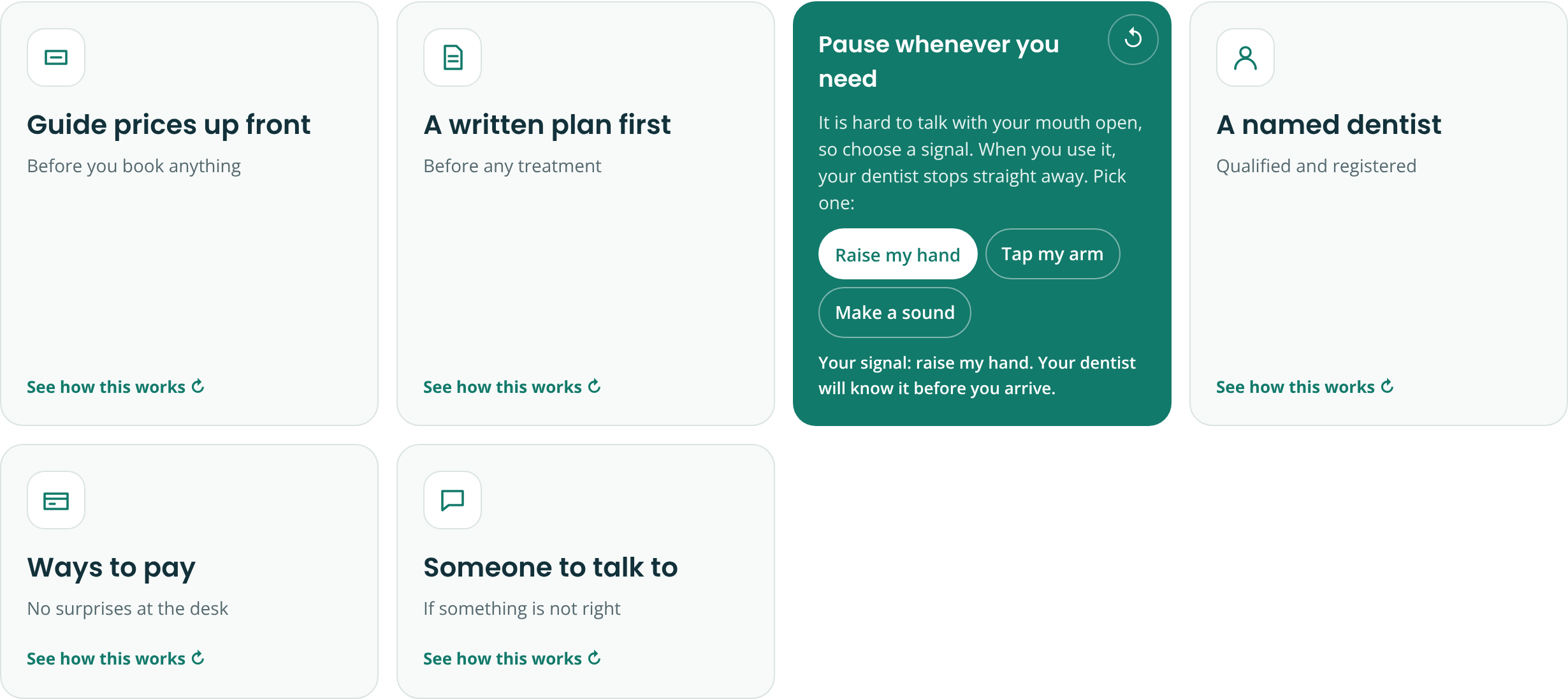
Ivory Lane shows six promise cards: guide prices up front, a written plan before any treatment, pause whenever you need, a named dentist, ways to pay, and someone to talk to if something isn't right. Each card flips over to explain how it works. The pause card goes further and asks the visitor to choose their stop signal now: raise a hand, tap an arm or make a sound.
A promise the visitor can act on: choose your stop signal before you arrive.
Picking the signal at home, before the appointment, makes the promise real.
6. Ask one thing at a time, and show how far they've got
Medical forms are a classic source of stress: a long page of questions, some of them personal, with no sense of why they're being asked.
The GOV.UK Design System, the guidance used across UK government services, still tells teams to start by asking one question per page, because it helps people understand what they're being asked and focus on that one answer. Ivory Lane's check-in follows that idea. There are six short questions, one at a time, each with a line explaining why the dentist needs to know.
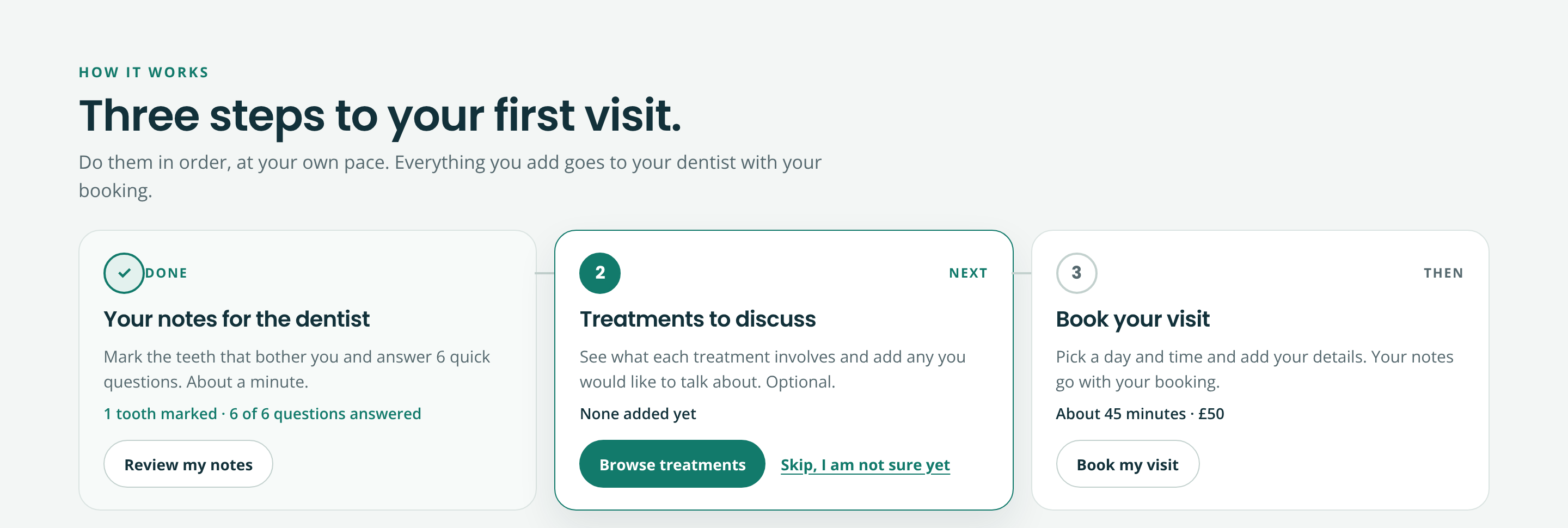
The whole process is then shown as three steps: your notes for the dentist, treatments to discuss (optional), and book your visit. Each step is marked Done, Next or Then.
Three clear steps, each marked Done, Next or Then.
Visible progress helps, with one caveat. A meta-analysis of 32 experiments on progress indicators in online surveys, by Ana Villar, Mario Callegaro and Yongwei Yang, found that indicators which moved quickly at the start reduced drop-outs, while ones that crawled early on increased them. So the quick tasks come first: the six check-in questions take about a minute.
7. Never make them repeat themselves
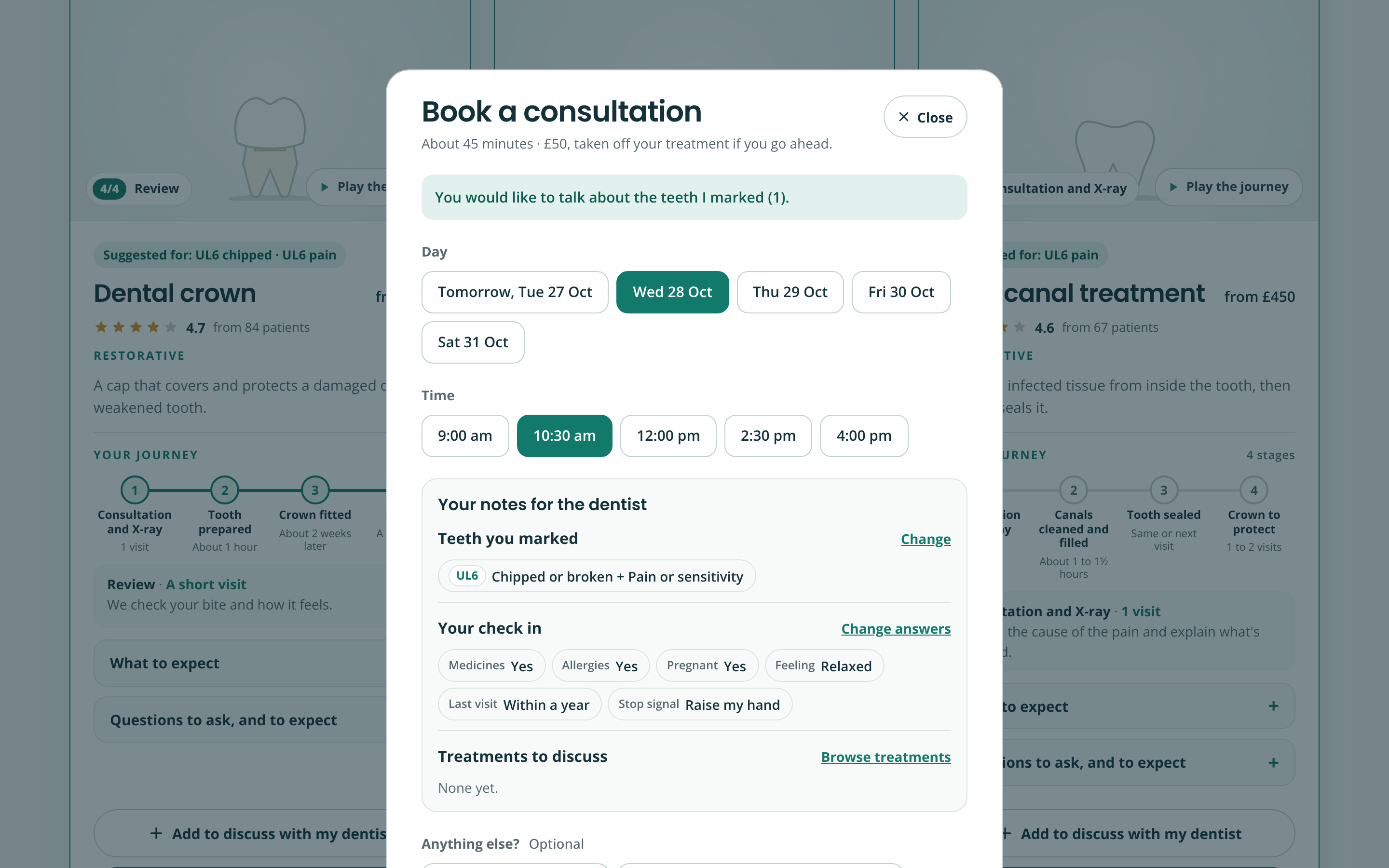
Everything the visitor adds (the teeth they marked, their check-in answers, the treatments they want to discuss) is kept in one record. When they open the booking form, it shows those notes rather than asking again. All that's left is a day, a time and contact details.
The booking form shows what the patient already told the practice instead of asking again.
For an anxious person, being asked the same question twice feels like nobody was listening. For the practice, it means the dentist sees the notes before the patient sits down.
See it in action
The walkthrough below follows one patient from marking a tooth to a confirmed booking.
Where else this applies
Any service people approach with some dread can use the same patterns. A family law firm can show the stages of a divorce with typical timescales and fees. A vet can explain what happens at an emergency appointment and roughly what it costs. A mortgage broker can ask one question at a time and show what happens after the first call. In each case, the aim is the same: answer the worried questions before they turn into a reason to leave.
One caution for healthcare and legal sites in particular. Treatment descriptions, timings and promises need to be checked by the professionals who will deliver them, and they have to follow the rules for the sector. For dental practices in the UK that means the General Dental Council's guidance on advertising.
A quick checklist for your own site
- Can visitors describe their problem without knowing the technical term?
- Are guide prices on the page, with a note on what changes them?
- Does each service show its stages and how long they usually take?
- Is there a clear picture of what happens on the first visit or first call?
- Are your promises specific enough for a visitor to test?
- Do forms ask one thing at a time and explain why?
- Does information the visitor has already given carry through to the booking?
Frequently asked questions
How do you design a website for anxious users?
Reduce uncertainty. Show what will happen, in what order, how long it takes and what it costs. Use plain language, ask for information one step at a time, explain why you're asking, and give people a sense of control, such as being able to pause or skip.
Should a dental practice show prices on its website?
It helps patients decide. In the Adult Oral Health Survey 2023, 23% of adults in England said cost had led them to delay dental treatment. Guide prices with a clear note that the written treatment plan confirms the final figure give patients something to go on without overpromising.
How common is dental anxiety?
The Adult Oral Health Survey 2023, published in December 2025, found that 15% of adults in England with natural teeth had extreme dental anxiety and 40% had moderate or severe anxiety.
Is it better to put one question per page on a form?
For many forms, yes. The GOV.UK Design System advises starting with one question per page because it helps people understand what's being asked and focus on the answer. User research can show where related questions are better grouped together.
Why show progress steps on a booking process?
They help when progress feels quick early on. A meta-analysis of 32 experiments found that progress indicators which moved fast at the start reduced drop-outs, while slow-starting ones increased them.
Ivory Lane Dental is a concept we designed at Web Choice; the practice, team and prices are samples, and a real build would have its clinical content checked by a dentist. If your visitors arrive nervous, we'd be happy to look at your booking process through their eyes.
Author: Tom Maynard | Company Owner of Web Choice UK
Tom Maynard is the Owner of Web Choice UK, leading a skilled team specialising in Web Design, Web Development, SEO, PPC, and Software Development. With over 20 years of industry experience, his focus is on delivering data-driven, high-performance digital solutions that help businesses scale and succeed online. Under his leadership, Web Choice UK builds websites and applications that are fast, secure, and optimised for search. Their strategies are designed to maximise visibility, drive qualified traffic, and generate measurable ROI.
Follow the Expert:


